Vancouver has two modes: stunning and stunning… but wet. And honestly? The rain is part of the charm. It softens the light, deepens the greens, makes the ocean look dramatic, and turns everyday city scenes into something that feels cinematic.
If you’ve ever taken a photo on a rainy Vancouver day and thought, “Why does this look like an album cover?”—that’s exactly the kind of image that makes a killer canvas print.
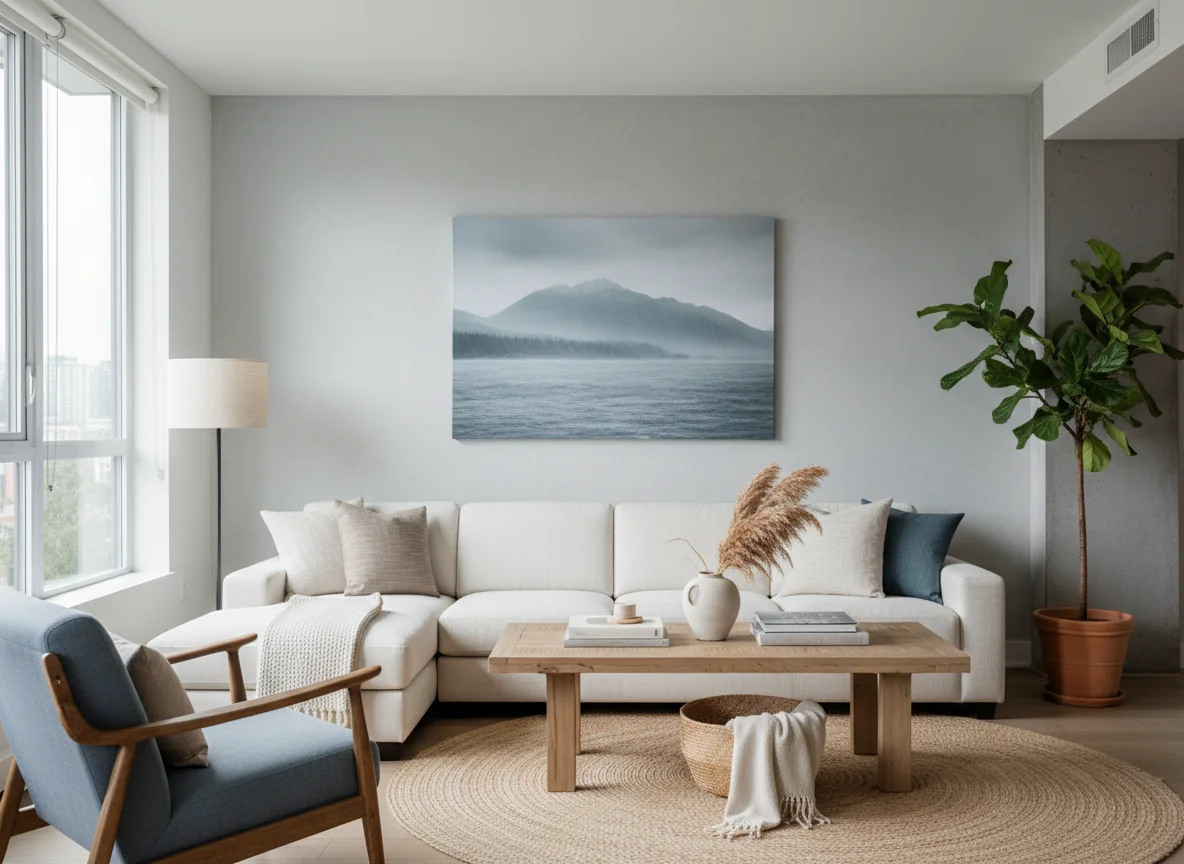
This post is your guide to building a Vancouver-style wall using your own photos (or art): moody coastal neutrals, rainforest greens, and that calm West Coast vibe—without your home feeling dark or heavy.
You’ll learn:
- what rainy-day photos print best on canvas
- how to choose sizes that suit Vancouver condos and homes
- layout ideas that look curated
- simple editing + file tips so your prints look sharp
Why rainy Vancouver photos look amazing on canvas
Rainy-day photography has three things canvas loves:
- soft, even light (less harsh shadow, more detail)
- richer color (greens, blues, charcoal tones)
- natural mood (the photo feels like a moment, not a pose)
Canvas adds texture and depth, which makes misty mountains, wet streets, and ocean horizons feel more like art and less like “a picture I took while running for the bus.”
Step 1: Pick your wall vibe (so it feels intentional)
Vancouver walls look best when they have a clear mood. Choose one:
Vibe A: Coastal calm
Think: ocean horizon, driftwood, pale sky, soft greys.
Vibe B: Rainforest green
Think: Stanley Park, moss, ferns, deep greens with a little fog.
Vibe C: City-in-the-rain
Think: wet pavement reflections, umbrellas, neon, streetcar lines, downtown glow.
You can mix them, but start with one dominant vibe so the wall doesn’t feel like five different personalities arguing.
Step 2: The Vancouver photo types that print best on canvas
Here are the photo styles that consistently look stunning as custom canvas prints in Vancouver:
1) Mist + mountains
North Shore mountains with fog? Instant gallery piece.
What works:
- wide shots with layered hills
- a single tree or shoreline in the foreground
- muted colors (don’t over-saturate)
2) Ocean horizons
English Bay, Kits, Spanish Banks—simple horizons look expensive on canvas.
Tip: horizons look best as wider canvases (like 20×30 or 24×36).
3) Rain reflections
Wet streets are basically free special effects.
Look for:
- reflections of lights
- puddles with texture
- leading lines (sidewalks, crosswalks)
4) Forest texture
Close-ups of:
- moss
- ferns
- bark
- raindrops on leaves
These are perfect for smaller canvases and gallery walls.
5) Real-life people shots (but not posed)
A candid walk in the rain, a coffee shop moment, a kid in a rain jacket—those photos feel like Vancouver life.
Step 3: Size your canvases for Vancouver spaces (condos included)
A lot of Vancouver homes have great natural light but less wall space. The trick is choosing sizes that feel substantial without overwhelming the room.
Best “hero” sizes
- 20×30: big impact, easy to place
- 24×36: statement piece above a sofa or bed
Best gallery wall sizes
- 12×16 and 16×20: mix these for a clean, modern look
Best small accent sizes
- 10×10 or 8×10: perfect for shelves, desks, and tight corners
If you’re working with a smaller wall, go with one strong hero canvas instead of many tiny ones. Small walls with too many pieces can look cluttered fast.
Step 4: Layouts that look “designer” (without the designer)
Layout 1: The calm triptych
Pick one scene (ocean, mountains, forest) and split the story across three canvases.
- 3 canvases of the same size
- even spacing
- clean and modern
Layout 2: The hero + texture wall
- 1 large landscape (20×30 or 24×36)
- 2–4 smaller texture shots (moss, rain, close-ups)
This is the easiest way to get a Vancouver vibe: big calm scene + small details.
Layout 3: The tidy grid
If you love clean lines:
- 4 canvases the same size (12×16 or 16×20)
- consistent spacing
Grids are especially good for “Four moods of Vancouver” (ocean, forest, city, mountains).
Step 5: Editing tips (so your rainy photos don’t print dull)
Rainy photos can sometimes look flat if they’re underexposed.
Here’s the simple edit approach:
- lift exposure slightly (don’t blow out the sky)
- add a touch of contrast
- keep saturation natural (Vancouver greens don’t need help)
- sharpen lightly
If you love the moody look, keep it moody—just make sure the details are still visible.
Step 6: Make sure your file is print-ready
Before you upload your photo:
- use the original file (not a screenshot)
- avoid heavily compressed images from messaging apps
- if it’s from a newer phone, you’re usually good
If you’re unsure, upload it anyway and we can help confirm the best size for sharp printing.
Why museum-grade materials matter for moody coastal prints
Moody photos rely on subtle gradients: fog, mist, soft sky, shadow.
That’s why we print with:
- premium cotton canvas
- pigment-based archival inks for long-lasting color
- handcrafted Canadian fir stretcher bars made in-house
You get depth, detail, and a canvas that holds up beautifully over time.
Vancouver idea: build a “rainy-day calm” wall for your entryway
If you want your home to feel instantly calmer when you walk in, put your wall where you’ll see it daily:
- entryway
- hallway
- the wall you face while making coffee
Choose:
- one ocean horizon hero canvas
- two smaller forest texture canvases
It creates that West Coast calm vibe without needing a full room makeover.
Ready to turn Vancouver moments into wall art?
If you’ve got rainy-day photos, ocean horizons, or forest walks you love, we’ll help you turn them into gallery-worthy canvas prints—handcrafted, museum-grade, and made to last.
Order online anytime and enjoy free delivery on every order.